The Security Score
Project Overview
Further researching opportunity areas which aimed to address giving users a better understanding of evaluating their safety and what ongoing risk they had. This resulted in us designing a scoring feature that would drive user engagement, retention and activations alongside a soft IA shift
Role
Product Designer
Timeline
2 Months
Project Snapshot
Problem
User’s own online footprint presented risks that lead to identity fraud
Users didn’t understand how good or bad they where doing in terms of safety
Users weren’t engaging enough with the content that was already on Protect to make them safer
Process
Discovery - Understand what security risks our users can face and how we can drive better security habits through an evaluation of their risks
Define - Narrow our focus to a score evaluation approach
Discovery - Understand the different ways we can approach a score evaluation and what core problems and needs our score need to answer
Ideate and develop - Conceptualise several iterations for the score evaluation and test with users
Impact
Increased Metrics
Increase in percentage of users completing actions - Free increased by 50% and Paid by 33%
An increase in benefits page discovery (The sass / payment page to a subscription) by 12%
An increase in retention - by 5%
Those who view the breakdown page are 3x more likely to improve there score and 10x more likely to upsell
Users are 4 times more likely to complete a security tip action
Users are completing more actions in a take
The Bottom Line
Safer Users - More security actions being taken
Increased Product Value - Users are seeing more of the product and engaging with it more
Higher Team Moral - Squad moral and productivity rose
Business buy in - Presented this in the company meeting and conversions on launching Protect in other markets began
Solution
Added a score that evaluated all users security actions
Redesigned Overview, added a score analysis feature and drove action types by explaining why it matter
Context
Introduction
Protect 1.0 (MVP)
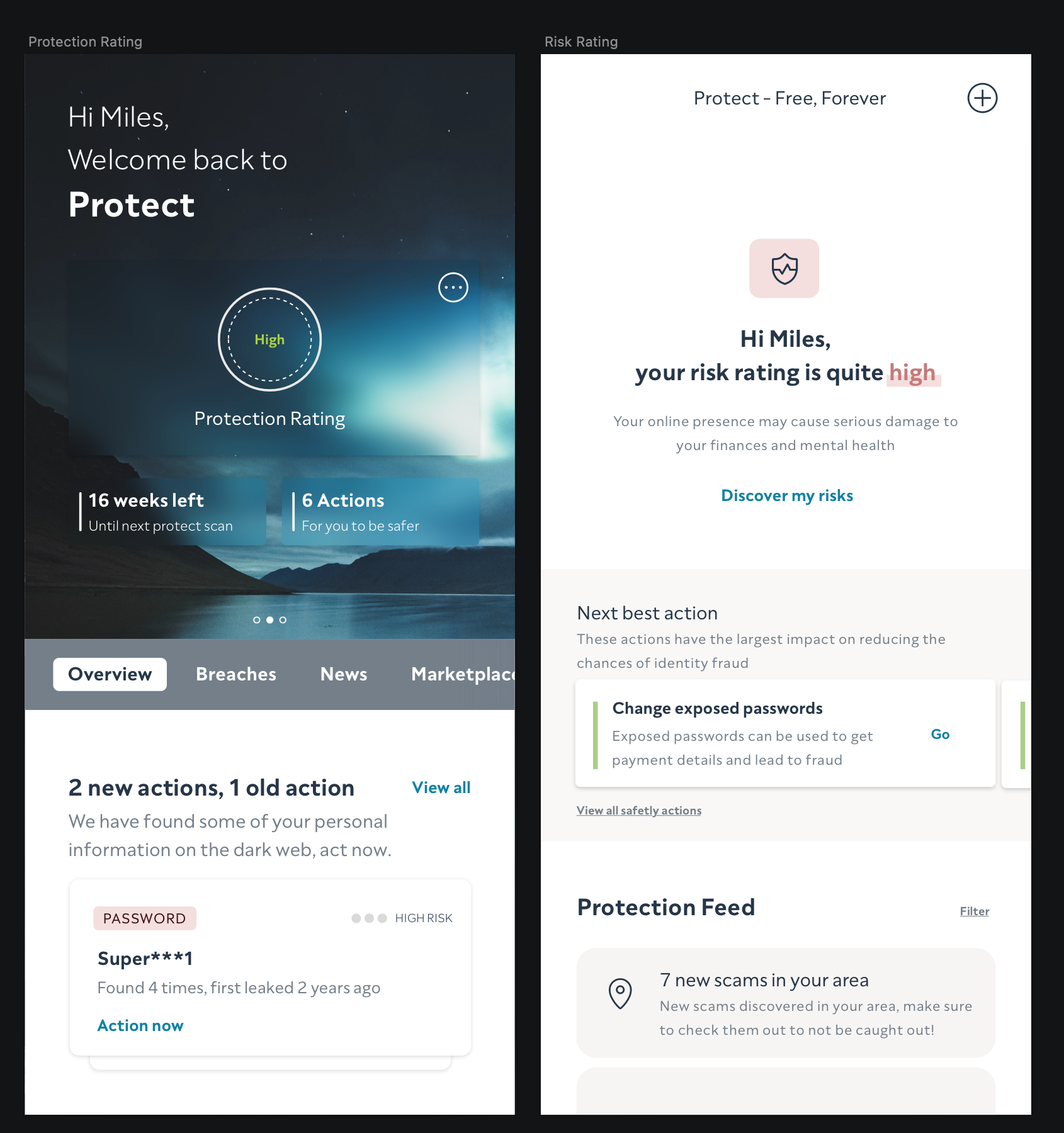
This is the Product in its MVP format. It showed data breaches (passwords in this instance) to the user in hopes that they would action at risk information. Action at risk information is a great way of reducing factors that lead to fraud, something that ClearScore internally deals with on a daily basis.
Product History
ClearScore Protect was a product that lived within the ClearScore App but was very separate from the normal credit space proposition as it focused more on identity fraud and had a subscription model to it. It is a product that was very early in its lifecycle and was still considered a MVP. It had some great impact and reached 2 Million Activations and 20K paid subscribers which was a strong showing of what it was offering users
Post Discovery
After a 5 week discovery period which ended in ideation workshops and a new sets of opportunities areas we had a large amount of work in front of us. Lots of this research and many discussions we had looked at how we could create more value for our users and move Protect into a better version of itself but there were still a few aspects we needed to nail before developing solutions
At this stage we had uncovered a range of opportunity areas, it was now up to me and the other designer in my squad further discover more insights and to start developing concepts
The Evaluation Pillar
Internally we referred to opportunity areas as pillars so people understood what we were speaking of in terms of solution development. The first area we wanted to look into was evaluation, we felt like this would address a range of different user problems and be beneficial for the product’s activation goals. We kept getting a range of ideas from people within the company since Protect launched to do more in the product that had this type of feedback mechanism and more importantly our discovery pointed at some core user problems to solve in this area too
Solution Mapping Exercise
We looked at a range of different solution types and decided on going with a “Security Rating” solution as a direction. We had quite a bit of buy-in from initial chats with Product / Engineering around solution types like this and we felt like it would have the brand impact Protect needed
Constraints
The branding of the product was currently changing
An expectation to design big changes
Evaluation type solutions where challenging to design for
Ongoing stakeholder management
Web driven experience that scaled to apps
Responsibilities
I was responsible for problem space exploration and solution development from beginning to end. I led on discovery and problem space exploration and designed the end solution in collaboration with the other designer in the team in order to meet tight timeframes. We also kept C-level and department heads in the loop on this work on a weekly basis
Next Steps - More Discovery
There was an exception at this stage for design in our squad to be jumping straight into developing solutions but after a review of this work the other designer and I agreed that one of us should dive into the problem area a bit more while the other should focus on some of the short term delivery for now. This resulted in me looking at the ‘evaluation’ opportunity area more
Part 1
Evaluation Discovery
How we came to decide Protect needed a rating
Framing the discovery
I started by wanting to define what we knew and what we wanted to better understand and assess our discovery scope. This discovery was framed around taking a deeper dive refining how we could give a user a better evaluation of their risks
What was the driving insight?
Initially, we observed there was a disconnection of risk which was observed in user interviews. A majority of users didn’t think fraud could happen to them and they somehow thought that they were safe from it regardless of their online footprint / behaviour
Why is it a problem?
Because of this apathy, our users seem to think that they ‘didn’t need’ a service like Protect and they didn’t understand why they needed to action breaches. This leads to people continuing to be at risk of online fraud
Who is it a problem for?
This was a problem for both our users and the business
By the users not keeping track and actioning data breaches it meant that they are more vulnerable to online fraud. From a business perspective, retention was lower than it could be and activations had untapped gains
When did it become a problem?
We had slowly observed this behaviour in product a month after launch in follow up user interviews and tracking analytics
What is likely to happen to this problem over time?
This problem is likely to become an opportunity cost to the product and business. As our users continue to feel like they don’t need to protect their identity online, this would significantly reduce engagement and retention. This might also be the difference for a small number of users of being scammed in the future
Research Goals
Gain a stronger understanding on user behaviour and attitudes to exposed data, how their online footprints relate to crime and what opportunities areas we have to highlight this to users in a holistic way
Methodologies
Since we had just undergone some primary research around parts that relate to this research goal for the 2.0 Discovery, I chose to mainly use secondary techniques to get more learnings and re-use past research findings
Heuristic Analysis
Product Analytic Data
Competitor Analysis
Research Papers
Insight Analysis
Secondary Research
Heuristic Analysis of Protect 1.0
Heuristic Analysis
I worked with the other designer on my team to go through the current product. We had started thinking about this before this discovery fully started but we finished a rough review of the current experience and how it it displayed content
We looked at how the product displayed content back to the user around exposed information. We found there wasn’t a true reading of a user’s health or online footprint in the old version. It was purely more about showing back things to action or things that were found on the dark web. A number counter was present but it wasn’t very descriptive, we had opportunity to attempt to connect the dots for people
Data showing “Actioning” content
Product Analytical Data
I looked at a range of analytic data that we had on the product, we were fortunate to have a lot to dive into in terms of funnel metrics, retention, activation and upsell rate. I found a range of quantitative behavioural data on the product and discovered a few things of note
Despite over 2 Million users activating Protect and most having security actions to complete only a small percentage were completing them all. This number was also dropping over time, which indicated that the users entering were less driven compared to the early adopters. More importantly it suggested that we had opportunity areas to address the inaction
Insights from User Interviews
User Interviews - Core insights
I then looked over some of the findings we got from the interviews we did for 2.0 Discovery. Here were our key findings:
People had a false sense of security
People thought that if they were to become a fraud victim, their bank would cover it for them
People had a minimised perception of the risk because they thought online fraud and identity theft would never happen to them
People were likely to change their attitude to fraud protection when a family member or close relative was a victim of online fraud.
Some Core Behaviours and Insights from 2.0 Research
User Insights - Behaviours and Attitudes
This was one of the main areas of research that has been quite helpful in guiding a lot of the design decisions going forward. This showed how users thought directly about the current product and general opinions on identity fraud in general. We identified two types of users:
Type 1:
Apathetic, they didn’t think fraud would happen to them
This user group was the largest type
Likely to benefit most from the product
Type 2:
Security and risk aware, their attitude was that security mattered to them and they were taking actions to secure themselves
Smaller portion of our users
More likely to purchase the paid version of the product
Either likely to be past victims of fraud or knew someone who had been exposed to fraud
Naturally more worried and anxious about their security
Here I looked at the two types of users and mapped what behaviours and attitudes crossed over.
Google’s Security Checkup
Competitor Analysis
The other designer I was working with looked at different ways we could integrate and move forward to better utilise industry patterns. Visuals were taken to be studied further of how they look and behave in a flow. There were a few really interesting ones, I liked Google’s evaluation tool for safety it was quite subtle and was striking enough for someone to understand what to do next
CIFAS Research Paper on ID Fraud
ID Fraud - Research Papers
I did some very specific research to discover more industry learnings around behaviours and attitudes of the UK population. While we had previously done some of this with CS users it was important to know the general consensus around some areas with the population overall. We found out more around how many people were victims on average and what sort of mental states they would be in afterwards. There was some interesting findings (From CIFAS) which was aimed more at the credit space which was very useful for us
Mapping Data Types to Sources we currently / in the future have access too
Data Sources - Mappings
Pictured above is an exercise we did to understand what data sources we had, what data sources we would have in the future and what information we could display to the user
Protect at this stage had 2 sources which displayed to users some information available on the DarkWeb such as exposed passwords. However, as highlighted in the evolving protect case study, the product needed to be more well rounded and give a better snapshot of a user’s digital footprint
In addition to dark web data we would be getting information from the Deep web, marketing databases and public data bases. This within itself had multiple providers for each type which offered different packages of user information
We mapped all of these out in a grid to understand what could bring value to our users and how it could drive a security rating
Mapping - Risk Exercise
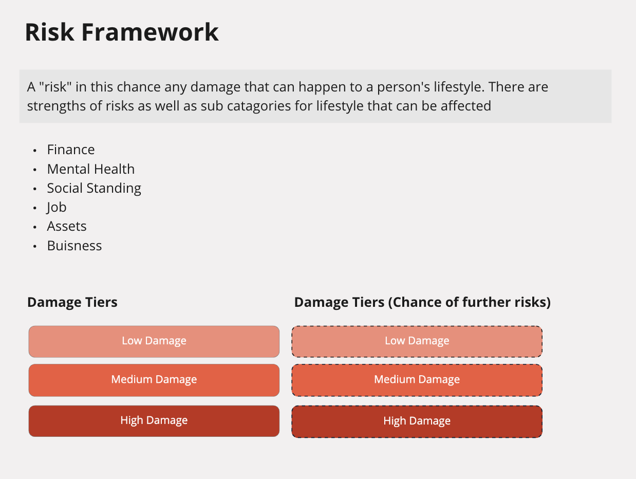
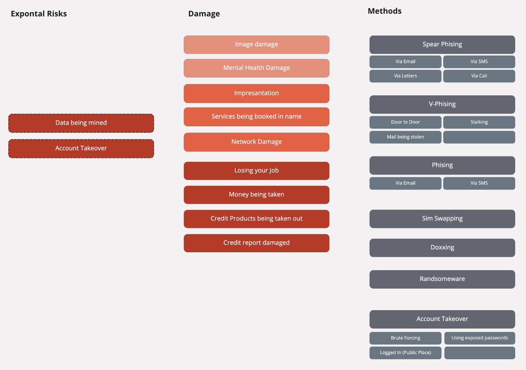
After reviewing all of this research, combining the various insights and looking into the data sources we had access to to power the experience, I tried to uncover more risk areas for our users by showing how people with different intent and skillsets could use your digital footprint against you. The aim of this exercise was to see how we could translate these data sources into information that could drive better security habits
This further highlights areas in which the product could translate static data sources into real user value to reduce risk factors that lead to fraud
Discovery Concluded
At this stage we had gained enough about our users needs, attitudes and behaviours and had a better understand of industry learnings. We also knew more about the risks that users could encounter, what data that could power their experiences, what it means for them and what actions can be done from our product currently and going forward
We defined the following key problems and opportunities:
User’s didn’t correlate online behaviour / footprint to fraud
User’s had an elevated sense of safety
We could analyse data sources and highlight fraud risks to people in a more human manner
We better understood what actions equal lower fraud risk
Part 2
IDEATION
“How Might We present an evaluation which highlights fraud risks to our users in order to encourage them to develop safer security habits?”
In this step, we wanted to generate ideas off of how we could represent this security information to the user. From the research we did on feedback mechanisms, we understood that there were different ways to display evaluation to our users and we set off to explore them
Showing different types of “Evaluation Feedback Mechanisms ”
These were the main ideas that came out of some ideation from myself and the other designer in the squad. We had reviewed many of the solution types and tried to output them in different ways. The purpose of this was to explore many different paths to a solution and see what fitted the best. The scored evaluation felt more on brand compared with the other types since ClearScore is known for disclosing a Credit Score. It is likely that users would have more of a mental model for driving action
We decided on a score approach because it allowed us to display information to our users in a digestible and interactive way. Our learnings from ClearScore and OneScore also gave us strong signal that a score helps users understand their overall situation and motivates them to take action. This seemed to fit our vision of giving simple evaluation and developing better security habits
Early Concepts for applying evaluation types (And shifting current IA)
In order to integrate this new evaluation type, we looked at how we could evolve the base product and how we could shift the IA forward based off of the audit of the current product. We did this to show how we could wrap the product around this evaluation feature
Achievement style evaluation type
I explored further solution types that were focused on providing information and incentivising user action through gamification. This concept wasn’t taken further at this stage as the team decided to focus on the score evaluation first
Part 3
Score Discovery
How do we develop a holistic score
Designing a score the best way
At this stage we knew a range of things about the problem area and had decided on a solution type but now it was about designing it the right way. We put together a list of learnings we wanted specifically about scores before we started development of the solution
A Smaller “Score” Discovery
The whole core team was involved from this point onwards very heavily. We started a ‘Score Framing’ discovery to gather important learnings and insights on how to develop a number based score the right way
OneScore App by ClearScore
Expert Interviews - OneScore
In the company there was a team who in the past designed an app that had a score (and quite a complex one). We interviewed the Lead UX designer and Head of Product that were involved with this project and spoke with them. We learnt a lot from their journey building a score, and even though their business model and product was far from Protect, it helped highlight areas of opportunity we hadn’t thought about. They’ve also helped us defined constraints and issues we were likely to run into
Main OneScore Learnings
Insights that I took forward directly for our use case
Start with a simple score
Score perception affects Mental Model
Define what “Good” is
Beware of users gaming it
What percentage of the user base its a flywheel?
LastPass’ Score
Competitor Analysis
I personally had done this before in the older discovery so didn’t spend too long here but we aimed at looking at how different companies displayed scores
Questions that should be solved by the solution
At this point we had enough of what we needed to now start developing the solution with real confidence. We highlighted the following questions to be answered:
How does the score benefit the user
How does the score provide ongoing value
How does the score reflect the users safety
How does the score get informed by different data sources
How should be build the right user experiences off of it
How do we promote friendly comparison (Should we even do this)
How does the score change from free and paid (Or should it be the same)
How do we make sure that this score isn’t confused with the Credit Score
Part 4
Concept DEVELOPMENT
Score design
Splitting development up
We were unlucky in that we didn’t get to speak with any design or product experts that had launched successful freemium model businesses but we were successful on finding areas that we wanted to further research if we got the opportunity . Doing this exercise as a design pair helped us further research the right things and refine our thinking on tests that we would want to run in the future
Driving an Experience with a Score
I did quite a lot of thinking about what aspects of the user experience could power the score. While the score was going to be mainly informed by data sources, I wanted to understand how we can then turn static data sources into something easy to communicate that would be relevant and tailored to users needs. This piece of thinking I’m really proud of but we opted to “park” it for now until V2, where we could fully integrate this thinking
Calculation Type - Bounded Score
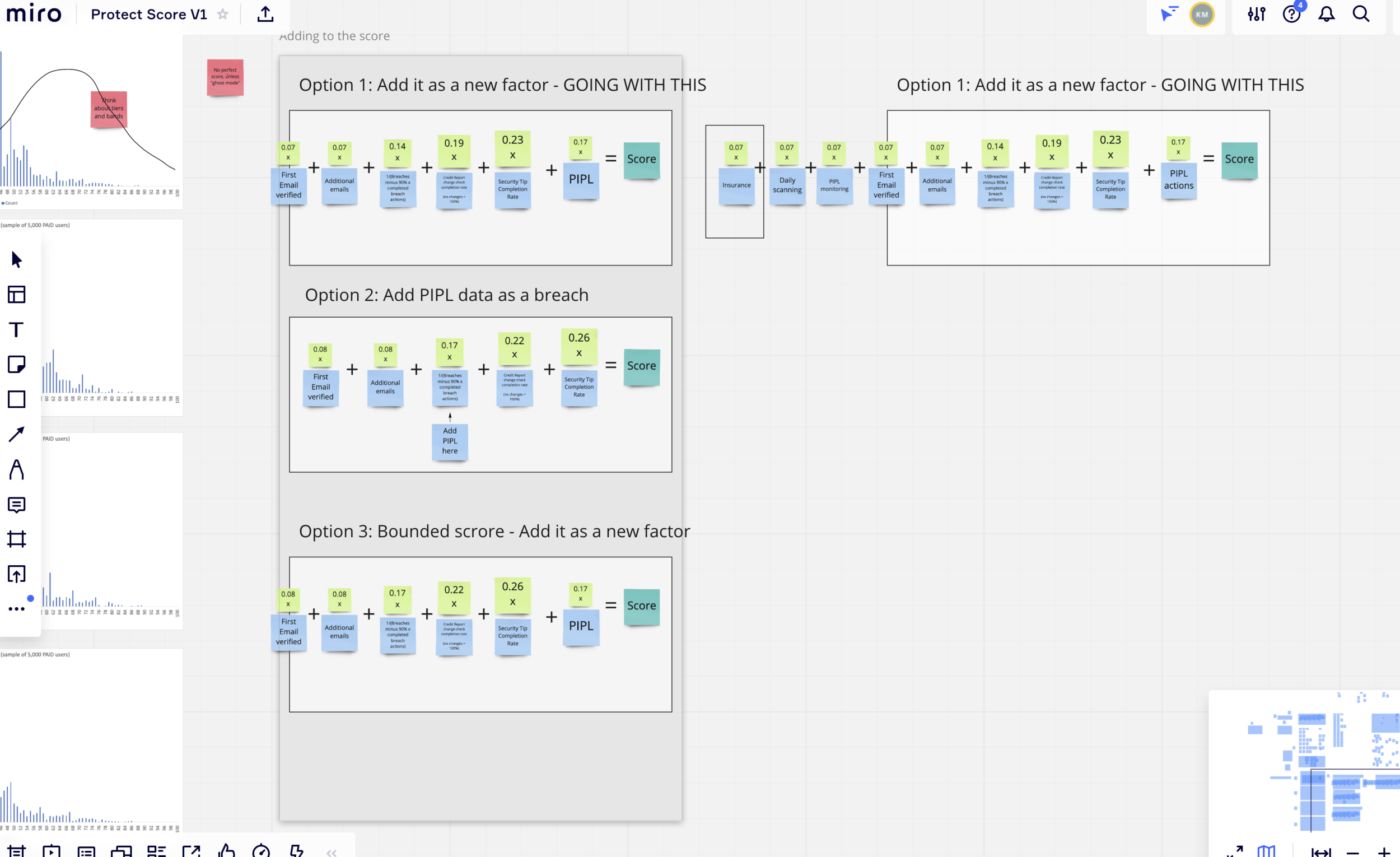
This piece of work was led by the analyst and over a series of group calls we agreed on how the score would be calculated from a technical point of view. This stream of work was happening alongside the UX development of the score from a design POV so there were many calls over 2 weeks to nail this in a manner that would work across the board. We decided on a bounded score type and it would be out of 100. This way it would better match the mental model of the credit score but be a 2 digit number to show a difference
Derisking the Score Calculation
Whilst going through the score calculation we asked many questions from a UX point of view of how certain edge cases might play out. We had many things to take forward in the design which helped us focus on what to deliver for a V1
Early Distribution
The analyst was able to map different forms of the model to our current user base. We used this to nail the weightings of the different categories (action types)

Usability Testing - A Basic Score
I drove a lot of testing with the score early on (while we were still figuring out how it would be calculated). We had many questions this solution needed to answer and I focused on trying to understand how users would perceive the score
I began with a quick usability test with a basic score design on top of the current Protect experience, the test had several questions some which were multiple choice and some open questions in which I noted down mostly what they said and what they did when interacting with the design
Interestingly people who saw it had a range of different thoughts on what the score was, how it was calculated, what order they pressed core categories, what it was measuring against and it fundamentally changed how they perceived actions
Key Learnings
Users had very different interpretations of how the score would be calculated
In a multiple choice selection to the question of “what do you believe the Protect Score Represents” the highest voted answers were “information that is involved in data breaches”, “how much information is available of you online”, “how safe you are from a hacker / cyber criminals” and “how safe your information is online from the places you visit”
Users had different mental models of what was happening in terms of calculation
Most users said that having a score was needed to some level
All users expected to be able to understand how the score was calculated

The first test and how we iterated off the learnings for a second design test
Usability Testing - A Basic Score + Drilled in view
So after the first test I learned a lot of things and fed this back to the team. I spent a few days going through the results and iterating on the solution to address some of the issues highlighted in our test results
Main aspects I iterated was the language and user interface to focus the user more around the product offering. I added a newer page which I called the “drilled in” page which would show to the user how their score had changed and how they could improve it. For the main overview I had tried to add more context to the design and added more branding elements to it. I then set up a test with 5 people to understand similar goals to the first test and note what changed
More folks this time understood the proposition and showed more interest in “pressing” elements. They overall had more questions and had a more accurate understanding of how the product worked
Key Learnings
The drilled in page had good reception from users, a lot of them tried to click on bits that weren’
Language changes where very effective
Overview had more information which translated into users having better expectations around the product
A shift of users thinking that this score was more related to the “chance” of identity theft — this isn’t a good thing
Score was still received well / positively
Users liked but where ultimately confused on the sub categories within the drilled in page

Usability Testing - A Basic Score + Score Analysis + Explainer
I had spent some time iterating the older design off of the feedback I received to This one was more visually applying and I tried to derisk score reception in a more direct way by adding another page (the dark one on the right)
I didn’t test this design with users but did guerrilla testing with staff and had feedback from my squad and design team
Key Learnings
Fix and Defend sections for the analysis page was received well and helped helped understand more of a split of actions
Score history idea was received nicely but might not be feasible to do until score was launched for a few months
People didn’t understand that the pills in fix and defend where clickable and link them to their outstanding actions
Some people felt the page looked to “Dribbble-y”
Overview changes where received well but likely wouldn’t be implemented with the current brand
Focus Shift
So at this stage the other designer I was working with started focusing on the visual design of the score and how it would sit in the overview page. On my side, I focused my efforts on how we would communicate the score to users, how it worked and why actioning security actions could benefit them

Part 5
Final design
Drumroll
Core Designs
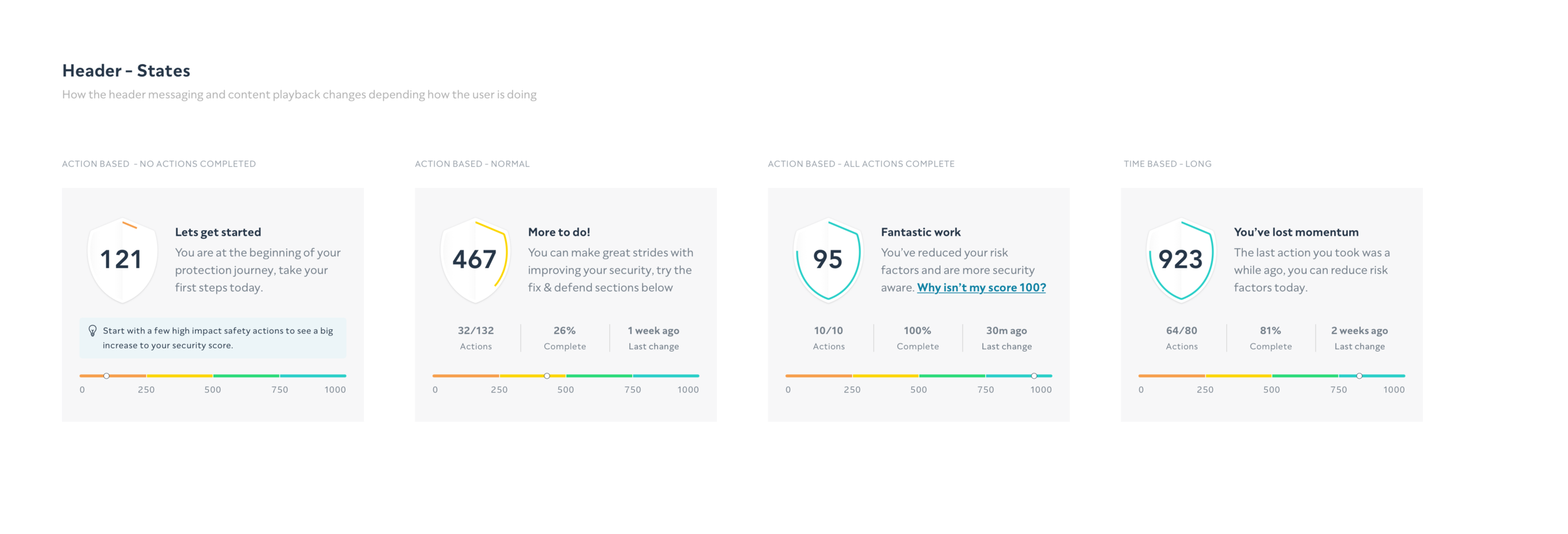
These show the core designs we delivered to change the app going forward. This shows “core” pages across large and small sizes as the designs themselves are heavily dynamic. I will cover off how these journeys work and different states later
New Overview [XL]
Score Analysis [XL]
Section Detail page (Stolen Passwords) [XL]
New Overview
Score Analysis Page
Section Detail page (Stolen Passwords)
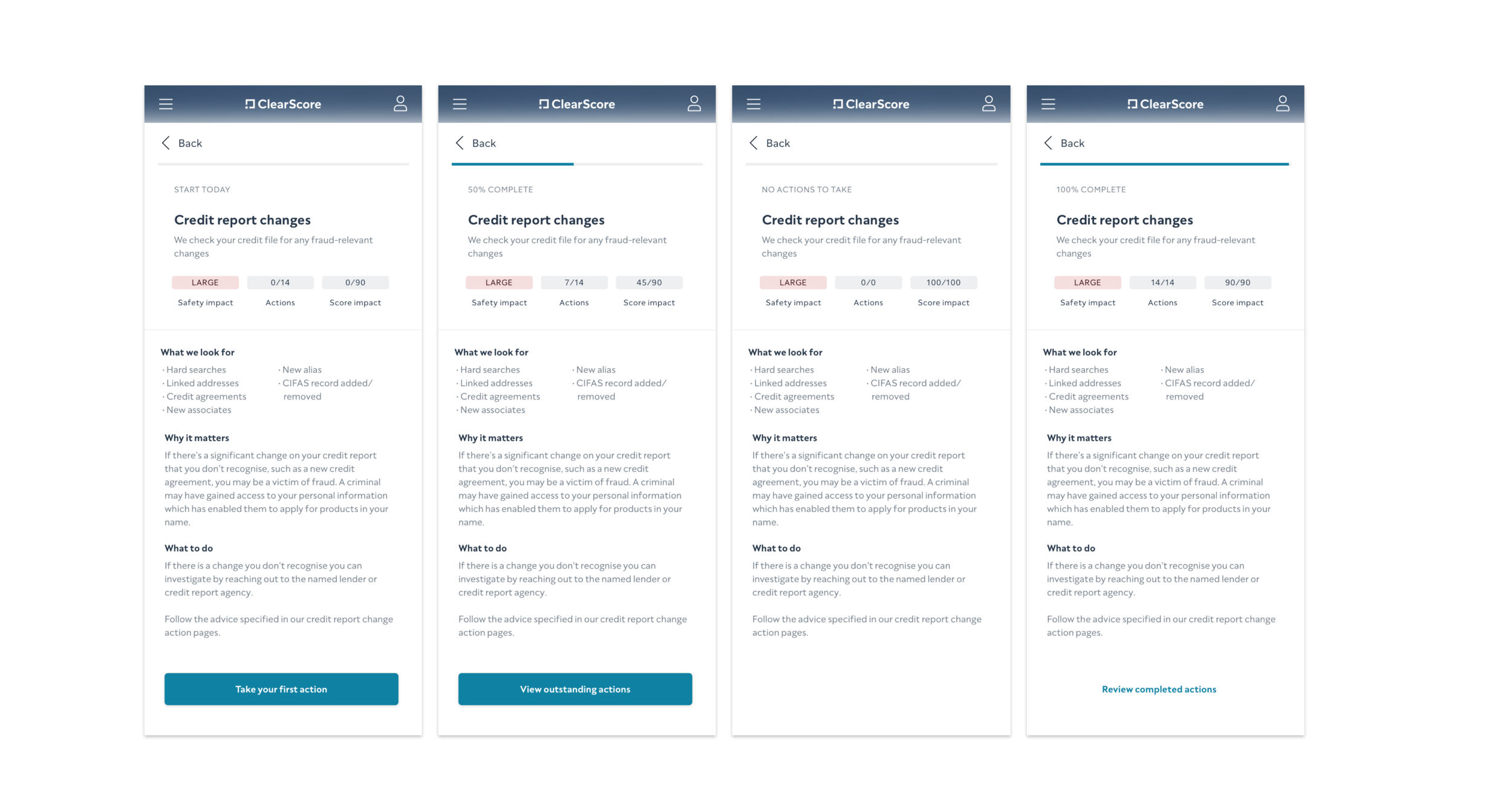
Section Detail Pages AKA “Sandwich pages”
These pages were visually similar but changed depending on user progress, subscription tier and category type
Outcome
Rebrand Campaign
The process of this project and opening to the whole team made everyone in the squad more design driven as well as helping everyone have a clear understanding of the user problems we where trying to solve
Stakeholder Approval
The roadmap and restructure of it was approved by the CEO and head of product when presenting it back to them
TBC Metrics
While this is harder to track, after seeing the Protect product slow down in terms of business performance for the last few months there was more much energy and productive after the ideation session within the squad
Key Learnings / Reflection
This was easily the hardest and most intense project that I have worked on in my career. It involved managing the CEO and many influential skakeholders on a weekly basis. It was a challenging but very rewarding project that really pushed me and the product forward
The internal company response was very strong with lots of people locoing it but some having some choice words to say about it
Designing a score is easily 10,000 decision across design, product and engineering so if I was to do a level of work like this again I would mentally prepare myself better
I could have managed stakeholders better and owned the room a bit more to get the design in more stronger footing
Thank you for reading!


![Protect Overview [S] - Products (A Test).png](https://images.squarespace-cdn.com/content/v1/66433ead53c05b68d3c80fbd/1715682994073-E6VTW4LXJ003WHKKA425/Protect+Overview+%5BS%5D+-+Products+%28A+Test%29.png)









![New Overview [XL]](https://images.squarespace-cdn.com/content/v1/66433ead53c05b68d3c80fbd/1715682994303-TF6934PXQM71GP2Q571V/Bitmap.png)
![Score Analysis [XL]](https://images.squarespace-cdn.com/content/v1/66433ead53c05b68d3c80fbd/1715682994325-530Q3CLTZ95U0K3VGGHZ/%5BXL%5D+Breakdown+page+%28Free%29+%28First+Time%29.png)
![Section Detail page (Stolen Passwords) [XL]](https://images.squarespace-cdn.com/content/v1/66433ead53c05b68d3c80fbd/1715682994315-2RYR8C1RSWFUJBTJGLK0/XL+-+Details+Page.png)


